

How to Create a Brand Style Guide For Your Business (And WHY You Need One)
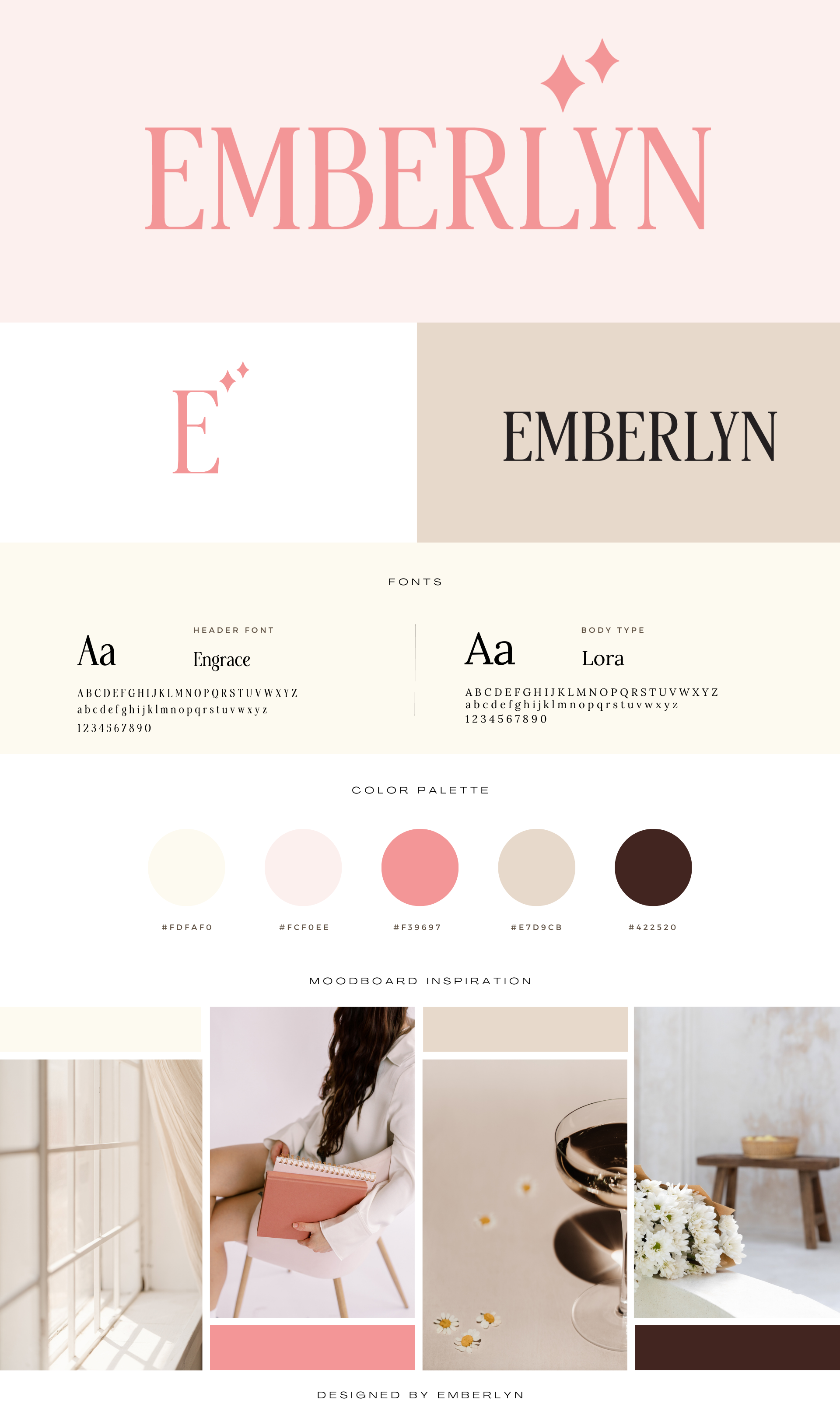
If you’ve ever gone to Pinterest in search of branding inspiration, you have seen a brand style guide like mine here. (See the image to the right with my brand style guide.) Just type in “branding” in Canva or Pinterest, and you will see them everywhere.
And maybe that got you thinking: what are they for, and why do I need one?
Well, we are going to not only answer those questions for you, but I’ll help you create a brand style guide for your business today.
A brand style guide is a visual representation of its logos, fonts, color palettes, elements, and photos. When all of these elements are brought together into one document, it is called a brand style guide. Think of it as a branding document that helps keep the train on the track.
Whether you are a one-woman show or you have a team, a brand style guide will help you maintain a consistent look and feel anywhere you are presenting it in the world.
Good branding is essential for any business, particularly a service-based business that is finding the majority of its clients online.
The colors, fonts, and logos help them make assumptions about what type of business you run before even interacting with your brand. A vibrant color palette with hand-drawn elements might tell them you are fun and playful, whereas a neutral color palette might tell them your business is relaxed and calming.
Emberlyn’s Brand Style Guide
Branding allows prospects and clients to connect to the human side of you through visuals and is a representation of how you operate your business.
We’ve all been to websites that don’t function well, have an aesthetic that turns you off, or look like they came straight out of ‘05. And you likely exited out of them faster than you arrived. This is because having a functional, well-designed, and updated website matters to end users.
Benefits of Having a Brand Style Guide
Everyone preaches about the importance of consistency when creating content. Whether you choose to post three days a week or five doesn’t matter, but showing up and posting consistently does because your followers expect to see something from you (it doesn’t mean you can’t make the occasional exception, though).
The same goes for being consistent with your branding.
Putting together a brand style guide creates consistency in two ways:
➡️ It allows you to see all the elements of your brand in one place, allowing for harmony throughout your brand.
➡️ It encourages you to be consistent with your branding to the outside world. Streamlining all external facing communications no matter which team member creates it.
Together, these things help you establish a strong brand identity, AKA, the personality of your brand. Your brand identity shows consumers not only what your brand looks and feels like but what it values and stands for.
Having a strong brand identity:
✨ Increases brand recognition
✨ Establishes trust and credibility
✨ Differentiates you from competitors
In 2024, 85% of organizations will have brand guidelines, and this is for good reason. 82% of consumers say they want a brand's values to align with theirs when making a purchase. Consistent branding and messaging allow consumers to feel like they know, like, and trust your brand and that your company is right for them.
Key Elements of a Brand Style Guide
Brand style guides simplify brand guidelines into one single document, like a pamphlet, to show the key visual elements of your brand. This allows your branding to be visible at a glance, further ensuring that no matter who is creating the content, they are more likely to stay on brand.
You will see varying information about what should be included in a brand style guide. I personally keep mine to a one-page document for simplicity and ease of use, so I do not include my tone of voice in my brand style guide; however, many companies do. If that would be helpful for you and your team, go for it, sister!
4 key elements to include in your brand guide:
➡️ Logos
➡️ Fonts/Typography
➡️ Color palette
➡️ Imagery/Graphic elements
How to Create Your Brand Style Guide
Before you open Canva and start working on building out your brand style guide, it is important to take some time to reflect on a few things.
Start by asking yourself these questions:
❔What is your brand's mission, vision, values and personality
❔ How do you want your brand to be perceived by the world
❔ What elements of a style guide do you already have
❔ What needs to be created
After you’ve done a deep dive to understand the direction of your style guide, it’s time to jump in.
Let’s break down your style guide into each element so you can fully understand why they are important.
Logos
Having clearly identifiable logos is the first step in creating a strong brand identity. Coca-Cola, for example,, has existed since 1886 and has only had two major design changes in that time. Consistency.
Because of that, they have created a universally recognizable brand. No matter where you are in the world, you know a Coca-Cola when you see one.
I’m not telling you you can only change your logo twice in 185 years. Of course, you can make changes more often than that, but take a pointer from Coca-Cola: Keep your branding consistent if you want to become recognizable.
Your brand style guide will include a primary logo, alternative logo(s), and submark logo.
The primary logo is the one that becomes recognizable, the one that is repeated on everything you publish. This logo is typically in the top navigation of your website and/or in the footer.
Alternative logos look similar to your primary logo but may have variations in color and layout. For example, a vertical logo vs. your horizontal primary logo or your primary logo without its surrounding elements.
Finally, there is the submark logo. It is a simplified version of your primary logo and can typically be used in smaller places, like your social media profiles or browser window icons (called a Favicon).
Fonts┃Typography
Fonts and typography can be difficult for designers and non-designers alike. Picking the right font pairing for your brand can be intimidating but here is a simplified way of thinking of it.
Your fonts should convey a hierarchy. The heading font should draw people's attention so they know what the most important information is. The subheading and body fonts should be easily readable, complementary fonts.
Keep in mind when choosing fonts that unless you pick free Google Fonts or Adobe Fonts, you will need to pay a licensing fee for your fonts to be used in print media or digital media.
Here are a few resources to help you get started looking for the right font pairings:
Once you have the perfect font pairing, you will likely need to upload them into Canva using this tutorial.
Color Palette
Be consistent when using brand colors, especially with the rise of graphics on social media. Your brand colors become recognizable on your followers' feeds because they are seen more often than your logo.
Your website should be consistent with this as well. If a website visitor is used to seeing the same three brand colors from you on socials you want that to remain consistent on your website because it can be startling and unfamiliar if they visually are different.
It is best to use no more than five colors in your brand style guide and you need to ensure that they contrast enough to use them for print and digital. The contrast of the colors is very important for accessibility, and can be very frustrating for website visitors when there is low readability.
An amazing resource for nailing down your brand colors is Coolors.co. On this website, you can upload an inspirational image to pull colors from and tweak your palette from there. They also have a Palette Visualizer where you can see your potential brand palette in real use cases.
Photos & Elements
Does your company typically use light, bright images or dark, moody images? Do you use more illustrations than photography? This portion of the brand style guide provides user guidelines on the types of images or elements that can be used in your designs.
This allows for consistency among designers when they are looking to pull stock images for their designs.
The amount of imagery on a style guide will vary depending on its design. If you are a one-woman show, 4-5 images might be enough, but if you have a team that is creating content, you may want to pick a style guide with more imagery to help them remain consistent.
Implementing and Maintaining Your Brand Style Guide
The key to implementing anything you want to become routine is to set guidelines and require their upholding.
1️⃣Train your team on the importance of using the brand style guide.
2️⃣Convey to all stakeholders that it should be used consistently across all platforms.
3️⃣ Regularly review the guide with your team and update it as needed.
If you stick to these three guidelines, the style guide will remain top of mind for your team, increasing the likelihood that everyone stays on brand consistently.
Build Your Brand Style Guide For Free - TODAY
Now that you know how important it is for your business to have a brand style guide, it’s time to start creating one so you can elevate your brand identity and ensure consistent branding across all platforms.
The Brand Style Guide, The Ultimate Checklist, is a free resource that includes a comprehensive checklist to make sure you include everything you need for your brand style guide. Plus, 5 free Canva templates to help you create your brand style guide today so you can have a cohesive and consistent brand presence now.